I have a table with over 30 fields, but I am mainly focusing on three of them for right now.
Field 1: RiskID
Field 2: Magnitude
Field 3: Likelihood
Likelihood and Magnitude contains a number between 0-10.
I inserted a XY Scatter chart where it graphs all the dots based on (Magnitude,Likelihood)
In other words for every record in my database, I have a dot that represents it on the XY Scatter.
However each dot looks identical, and after having over 25 dots on the scatter plot I am not able to identify which dot represents which record in my database.
Question: Lets say for example:
My first record in the database has the following values for the three fields
RiskID = BG3
Magnitude = 9
Likelihood = 8
then XY scatter will have a dot on (9,8) but the lable on it will be BG3.
Is it possible to do so? The Graph works, but I would like to label it with the information contained from the RiskID field.
When I check the Checkbox to display labels, every dot has the same generic label.
I don't know of a way to do this, but a cool way would be to dynamically add pictures to a form that shows your 10 by 10 grid. Each picture that is added will represent a dot, so each dot can be shown by a meaningful icon or picture. Preferably store the picture in the master data table (that the dot represents) as a linked OLEObject.
If we make the grid big enough we can show 4 icons max per square grid.
Then clicking on the icon can drill you down to the detail behind that. For mutiple dots of more than 4 dots in one square we could dynamically load an Image Combo Box with the multiple icons in a drop down for the users to either see, or choose from........
If you like the idea and need a hand......hmmmm....well OK, just ask. (What is your VBA like?)
Thank you and I sincerely appreciate your time and response.
I already tried getting the picture working, but the issue that I run into is I don't know how my records I will have in the database. Infact this database can contain over 100 records at least and because of that I can't have an image for each record.
This is really what I am trying to do:
As you can see all dots look the same. Left hand side graph only shows the dot for a particular record in my database. On the right hand side graph I have a dot for each record in my database. (Temporarily there are four records in my database).
As you can see Likelihood is 3, and Magnitude is 2. So the dot is located in the lower left hand corner. Instead of dot, is it possible to label it with informatoin contained in RiskID field. In other words label that dot with "4", since 4 is the value inside the box for RiskID.
I have been searching a lot on internet, and there have been many threads like this, but no one has ever replied to those threads. So couldn't get much help there either. But my VBA is very basic, but not afraid to learn if I am pointed in the right direction. Once again thank you and I sincerely appreciate you time.
Your plot shows "this is what I am trying to do". I fully understand your problem, but I think you mean "this is what it currently looks like".
What I would like you to do is put Access aside for the moment, open up a graphics package - even powerpoint if necessary, and draw what you really want. With all the bells and whistles, images, dots on dots and dots, how do you really want it. When you've done paste it back in the forum and we can go on from there. Please ensure you have mutiple dots in the same segments, and lots of dots all over the place. At least 40.
There may be many ways to display your data - even 3d image packages you can "fly" around your data - I don't want to restrict you, so you must do this. Once we have this, we will work out a way to get it for you from VBA.
Once again thank you and I really appreciate your time and help.
You are right: This is what it currently looks like:
And this is "this is what I am trying to do":
As you can see I am trying to get the dots on the scatter plot to label with information contained within "RiskID" field. So as the above picture suggest, a datapoint is graphed with (Magnitude=2, Likelihood=3) and RiskID is "BCG1". So the data point is located at (3,2) on the left graph with label being the information contained within the "RiskID" box.
Sorry if I caused any confusion. Any help is sincerley appreciated.
No, there is no confusion. I should rephrase my question. How do you want the names to be displayed when you have 5 or 6 dots on top of each other, next to other sets of magnitude / likelihood combinations that also have multiple dot combinations? How will you display the names then?
I have a partial answer that displays your RiskID for every dot you have. Am also looking at using hard returns in the label to be displayed for multiple combinations. WIll post .mdb shortly.
If you have a problem with .zip let me know, I'll post .mdb.
This should answer a label per dot. For placing multiple labels - I will work on an answer using hard-returns.
You may need to update the label fonts when new values get written that haven't been written to the graph before. It's a pain, but am also looking at that one as well.
Both fun and work (aren't they the same thing? Hmmm.....)
Have had to eMail you the .mdb - it's just over the size limit. Please let me know if you don't get it - some exchange severs don't like .zip
I have also zipped the rar file to 200k - attached, else wait for eMail.
We can make this report better if you want.......using a different method....when we have multiple dots on top of each other, how about circling or surrounding the dot(s) with the label names?
Quick Question though. How does this work (I am trying to understand this so I can learn from it):
Step1:
-You have a Table called RSKS (which as all the fields that I had set up).
-Then you have another table you created called XRSK (which contains 3 fields: LKHD, MGNT, DTXT)
Question1: I notice all the possible combinations have been written in the XRSK table. Then Why do you need DTXT field in the XRSK table? What is its funtion?
Question2: I also noticed a crosstab query has been setup. How does this enable the graph to show customized labels.
Questoin3: How did you create this graph?
Question4: Is there coding done?(When I look at the VBA code, I see the following:
Graphs typically hold data in column form. Some headers, and lots of data below. The header of the data series is usually the label that people want to see described in the graph e.g Forecast. Actual. Target. % Diff.
Our data is different as we have very little data per series (1 value per series in fact). And if we want to display the "label" in the graph, then it should be the column heading. An xTab query will do this for us which is why I used it. In the XTab query we set the Risk ID as the column heading so it now can be used as our label in the graph.
That works fine - that was the first example I sent you. But what happens if we have multiple values - i.e 1 dot represents several Risks ID's?
The column heading should now show many Risk ID's. But if we cocatenate many Risk Id's we get a long line of text, but what if we could insert hard returns so that the Risk ID's appear on separate lines? What I did was write a small piece of code that looks at the Magnitude and Likelihood values, and if there are multiple values then it concatenates the Risk ID's together putting a comma and a hardreturn in between the two. The place holder where we store these new concatenated values is in the new table under the field DTXT. Now we use exactly the same style of xTab query as before, but using the new table, and DTXT as the column heading. This concatenated value will now becomes the column heading for our labels so we can see multiple RiskId's as our label.
The code opens up two datasets. We open up the RiskID table and look individually at each record. For each record in the RiskID table we check the combination of Magnitude and Likelihood, and go and look up the XRSK table and check to see if we already have a RiskID for that combination. If we don't - we write the RiskID value there. If we do - then we take the existing value and add a "comma" and a "hardreturn" and the additional RiskID value. We do this until we reach the end of the RiskID file.
Code:
Function Update_HeatMap_Labels()
'This function loops through the risk records and appends the projectID name to the 10 by 10 grid recordset.
'If the value is empty, then insert the project ID.
'If it finds a value there already, it inserts a "comma" and "hardretrun" followed by the project ID.
'Then use the 10 x 10 grid values to poulate the chart.
'Set up our 2 recordsets
Dim rs_RSKS As Recordset
Dim rs_XRSK As Recordset
'Define rs as our Risk Table values as a query
Set rs_RSKS = CurrentDb.OpenRecordset("SELECT * FROM RSKS;")
'Define rsf as our values we want to check.  Set as dbOpenTable so we can write back to the table
Set rs_XRSK = CurrentDb.OpenRecordset("XRSK", dbOpenTable)
'Set all XRSK RiskId values back to blank (null)
DoCmd.RunSQL ("UPDATE XRSK SET DTXT = Null;")
'set the search index we want to look for as the primary key so we can find unique values of magnitude and likelihood to see if we already have a RiskID
rs_XRSK.Index = "PrimaryKey"

'Do while we have not reached the EndOfFile for our RiskID records
Do While Not rs_RSKS.EOF
    'Go to the first record in our XRSK so we can start searching
    rs_XRSK.MoveFirst
    'Find the first existence in XRSK of the same likelihood and magnitude as that of the RiskID in the Risk Table
    rs_XRSK.Seek "=", rs_RSKS!Likelihood, rs_RSKS!Magnitude
    'We don't need an "if not found..." as we knbow we ahve all combinational values in our XRSK table...unless you enter a RiskID with values of >9 and <0 and the program will error
    'Tell rs_XRSK we want to edit the record
    rs_XRSK.Edit

    If IsNull(rs_XRSK!DTXT) Then
        'If there is no RiskID in XRSK.DTXT, then set it to the RiskID value
        rs_XRSK!DTXT = rs_RSKS![Risk ID]
    Else
        'else a RiskID already exists in XRSK.DTXT, so add the two together with  a comma and hardreturn in between
        rs_XRSK!DTXT = rs_XRSK!DTXT & "," & Chr(13) & rs_RSKS![Risk ID]
    End If
    'Now we have directly updated the XRSK table we send the update command to write the record
    rs_XRSK.Update
    'Go find the next record in the RiskID Table and repeat.
    rs_RSKS.MoveNext
Loop

End Function
The graph query uses the SQL for the following:
Code:
TRANSFORM Sum(XRSK.MGNT) AS SumOfMGNT SELECT XRSK.LKHD FROM XRSK WHERE (((XRSK.DTXT) Is Not Null)) GROUP BY XRSK.LKHD ORDER BY XRSK.LKHD PIVOT XRSK.DTXT;
When you say "how did you set up the graph" - just the same as you did in your example. I am just using the query [q_Form_HeatMap_Graph4_Data] which holds the above SQL. If you start from 'scratch' you will need to set the label font and set the labels to be displayed - so select the graph (in design mode) until you can get to the "Chart Area". Setting the Font here will default your lables to this font. To enable all the series labels to be displayed, you will need to select the graph (in design mode) until you can get to the "Plot Area". Choose [Chart Options], select the Tab [Data Labels], and ensure that the check box for [Label Contains] -> [Series Name] is ticked. If you do not do the above this way you will need to double click on each and every dot to make the settings. This will set the values globally for all dots. I prepopulated the entire table of XRSK with label values, then did the above. The graph seems to remember them so if your dots move around the graph it still picks up the right settings for that plot combination of likelihood and magnitude.
My Next phase is very similar, where I have a field called EF Category (dropdown values = Strategic, Functoinal, Operational). I am going to create a same type of graph (a heatmap), only difference is, it will display only the risks with "Strategic" Category if "Strategic" Category is selected.
Ok - there are 2 ways we can do this. ANd they both have their "problems". The first is to add an additional field to XRSK that holds your EF Category values. This means we now have to hold 100 values of data for each EF Category you have. And what if you want to expand to another category e..g GH Category , we would have to have another field and now our data combinations become exponential. Not a good idea for expansion.
The other way is to simply to re-use what we already have, but means each time we change our drop down value we have to rewrite that values to XRSK. That's fine -I just don't like to keep modifying data in tables - unless you compact regularly your file size will grow and grow, so unless you are 2007 remember to compact regularly. This second option is what we will use. (See attached zipped rar file for modifications). We just need to modify our first recordset to only use the values equal to the drop down combo value for CD Category.
The combo only shows GroupBy (or unique) values of EF Category in your RiskID table. And the recordset now amends to :
Code:
Set rs_RSKS = CurrentDb.OpenRecordset("SELECT * FROM RSKS WHERE [EF Category] = """ & Forms!heatmap!cmb_EFCAT & """;")
Thank you for your response. I somehow din't check at this place for your response, and just realized you had actually already posted a response and a solution. You are wayyyyyy too advanced. HAHA. The dropdown functionality was exactly what I had in my mind, and you already demonstrated in CodeScripted_02 .
Sorry but following is where I get stuck:
I have a new query, which works exactly like yours, but I face problems in creating a XY chart from that query.
Here is what I mean:
Once I have a query which works, then I go to Form section to create a new form. I select Chart Wizard and the query from the drop down box below.
Then I get this following screen:
I try to select everything and tranfer all my dots to the right hand side, but I get the following error:
I am not sure why I can not transfer all my dots. Why am I limited to 6. Also I have the full professional Access 2003 edition. So I don't think there should be an issue with a limit to 6.
Then I continue, and come up to the following screen:
And I select XY Scatter, and the come up to the following screen:
I put LKHD on the X-axis, and all the rest of the dot on the Y-Aaxis.
I click finish and make the Chart by Column (so that the dots will be in series mode). But sadly Only the 5 dots were displayed because I was only allowed to tranfer 5 dot.
This is what I get:
Where have I gone wrong?
How can I get all the dots on the graph, and plus if I have more records, then I will have more dots added. I already created the button which does
graph2.requery. But not sure how to get more dots to show up on the graph.
Can you please guide. Thank you and I sincerely appreciate your time.
You haven't gone wrong - wizards aren't always 100%. Often you use them for the 80/20 - to get 80% of what you want in 20% of the time. We still need to finalise the remaining 20%:
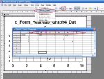
When you use the "Wizard", it is rewriting it's own use of the query that we have specifically created for the graph. When you have finished creating your graph (which you are correctly doing) go to the design mode and reset the Row Source Property back to the query name we have specifically created. In the case of Codescripted_02 it is q_Form_HeatMap_Graph4_Data
(Please ignore this next paragraph - just re-read one of your last inserts..)
However, the main check that is causing your problem is that your data sheet values must be columns and NOT rows. The wizard will probably set these to rows. See attached to change....else open up graph in design, double click graph till you get datasheet opened up, then from menu choose:
Data > Series in Columns.
If your labels don't display, or are different in font colour and size then see earlier message, else I can send you image of where to change.
Thanks Endre. You have helped me out big time. I believe I am in my finishing stages of the project, and wanted to let you know that I couldn't have accomplished this without your help. I sincerely appreciate all the help you have provided.
Politness and good manners will get you further in this world than you realise. You are most welcome and if there is anything more I can help you with just ask......
Personally, I really really like the TreeView control.
Here is a new look at Northwind ->
Attached is a sample contact database screenprint, and only uses 2 tables and is totally efficient in data usage (though 3 tables would be a littel better) ->
It's the same program. You just hook into the database of your choice and it runs VBA that generates an explorer / MSOutlook type frontend for you. Am still working on it though......
")


") , we would have to have another field and now our data combinations become exponential. Not a good idea for expansion.
, we would have to have another field and now our data combinations become exponential. Not a good idea for expansion.