Chart Question - Tick Spacing on Horiz. Axis

wilderfan

Registered User.
Local time
Today, 04:42
Joined
Mar 3, 2008
Messages
172
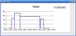
I would like to create a chart / graph with dates along the horizontal axis and dollars on the vertical axis.

The underlying data consists of 2 columns: $ amounts in 1 column and dates in the 2nd column.

IMPORTANT POINT: The time period between dates varies.

QUESTION: Is there a way to plot the data so that the spacing of the tick marks on the horizontal axis reflects the actual time period between the dates in the underlying data?

That is, I want to get rid of the uniform spacing of the tick marks on the horizontal axis.
 
Unless I'm not mistaken - just use the XY (Scatter) Chart as your Chart Type ?
 
Yes, that shows how the data points occur at irregular intervals over time.

One other question:

If I wanted to show the data as columns, is there a way to vary the width of the columns?
 
I don't know of a way of converting the XY Point Scatter to a Bar Chart, but the closest I can get at the moment for you is:

In the design of your chart find the section "Format Error Bars", and in the tab section [Y Error Bars] set Display = Minus, Error Amount = Percentage 100 %. In the [Patterns] Tab choose Custom and set the weight and style as large as you can.

And in the "Format Data Series" choose the Tab [Patterns] and set Line = None, Marker = None.

If I find any vba to make your "columns" (y-error) wider I will let you know, else this is the best non-vba I can come up with.
 
Thanks, Endre.

That works, sort of. The only problem is that the number of days between entries varies, but I am setting the width of the error bars to a constant amount.

Perhaps what I need to do is to repeat the $ balance for each day of the year, until it changes to a different amount.
 
There is a way to do this without writing values for each day (though that would be easier) and showing it as an X-Y Line Graph. Will dig it out - the result looks something like this attachment:
 

Attachments

  • Screen.JPG
    Screen.JPG
    35.2 KB · Views: 144
This uses a Union Query with one of the queries using the DMin Function to get the next values on the list. Not elegant, but it does the job. Add / alter some values in the table, click on the chart to update it.
 

Attachments

Looks good, Endre. Thank you.

I noticed there is a VBA module in the access file.

I'm no expert on VBA coding, but it looks to me as if that module isn't necessary.

Is that correct?
 
You are correct - that Module has nothing to do with this solution. The answer lies purely in the Union query. I have stored the queries in the database so you can see how it works. I have always struggled with DFunctions so I'm sure there is a better way to do this - but it works just fine nevertheless.
 

Users who are viewing this thread

Back
Top Bottom