vhung
Member
- Local time
- Yesterday, 21:08
- Joined
- Jul 8, 2020
- Messages
- 235
Good Day...
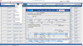
May this post annoying to AWF but all I need to know if this Design of acForm is accepted or not.
Alternatively, maybe there is worse than this.
\\: See attached acForm
May this post annoying to AWF but all I need to know if this Design of acForm is accepted or not.
Alternatively, maybe there is worse than this.
\\: See attached acForm
Attachments
-
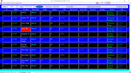 ColoredCform.png117.3 KB · Views: 101
 -
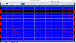 ColoredCform2.png109.5 KB · Views: 100
 -
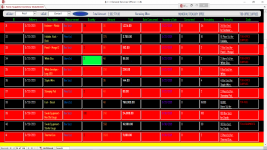 image_2021-04-15_093455.png72 KB · Views: 94
Last edited: