How would you change this design to more visually appealing to users? (1 Viewer)

adhoustonj

Member
Local time
Today, 15:24
Joined
Sep 23, 2022
Messages
156
Hey AWF,
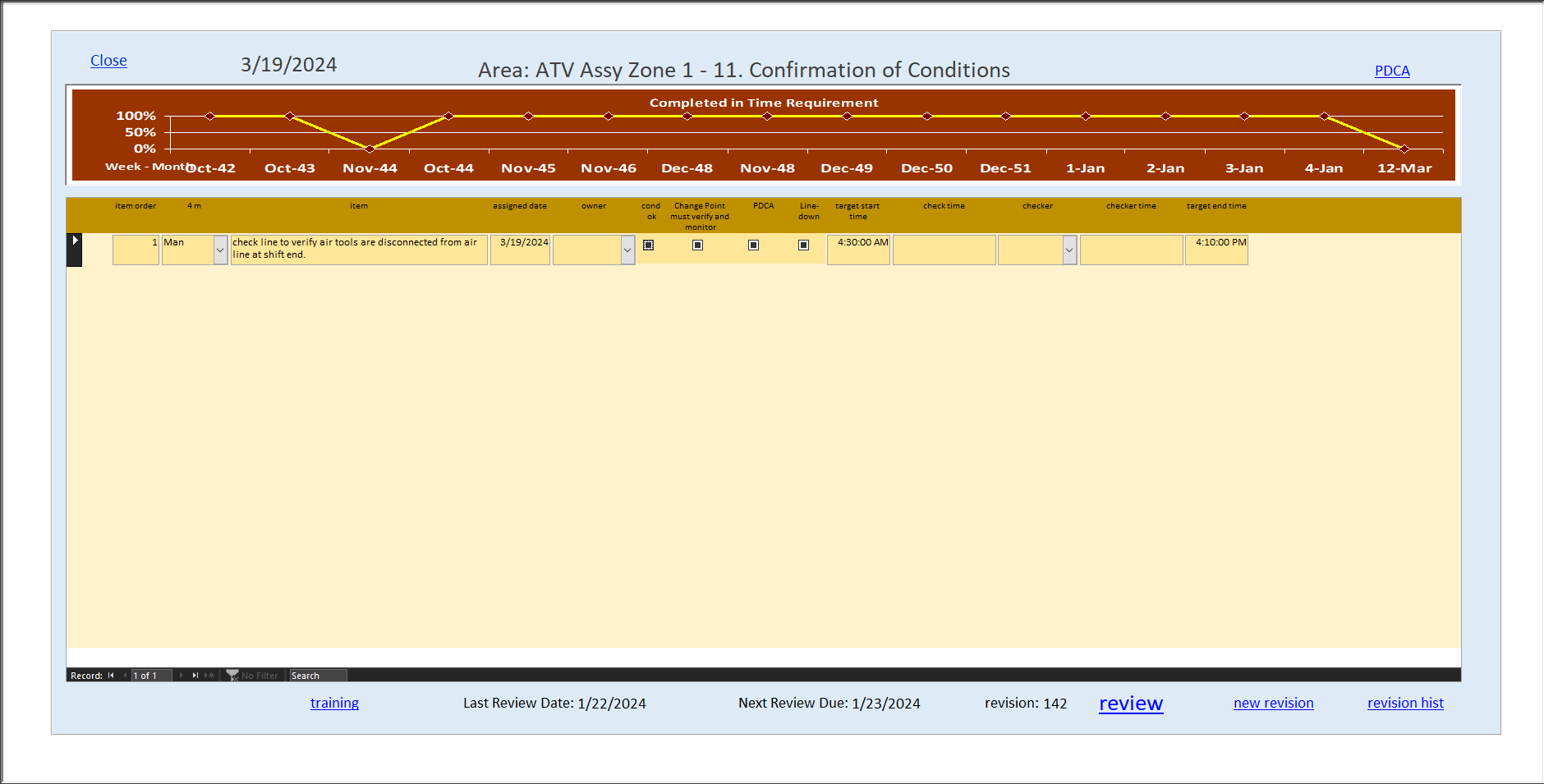
Any takes on suggesting how you would modify this form to be more visually appealing?
This is a full screen display form - maximized, resized to whatever 15 inch laptop to 72 inch tv is being used as the display.

I'm getting ready to at least turn all of the underlined blue texts into actually modernized command buttons with caption/hover text for hints, and possibly make more of a header/footer to display information and probably hold the buttons. I think the color scheme could use a blessing or two as well (Main reason I'm posting here), but all feedback or suggestions are welcome here.

Happy Friday

-- I do know there are resources and threads here but this is more on how would you begin to approach, or start with, or what ideas you would implement. I've enjoyed these two and many more.

1713553305102.png
 

tvanstiphout

Active member
Local time
Today, 12:24
Joined
Jan 22, 2016
Messages
230
Red is an alarm color, so I would not use it for graph background, even though this red is not super-agressive.
The texts above the graph should be on the same horizontal line.
The Close button is typically on the upper right. BTW, why have a Close button if the form already has (can have) a close button?
The date of 3/19: what is it? If it is today's date, that does not add much value. If it is the selected say Assigned Date, give it a label, similar to "Area".
Will users know what PDCA is? Even rookies?
The graph has overlapping text in lower-left.
The row of data has null values for the checkboxes. Are they not bound? Maybe that's OK in this case to indicate neither Yes nor No has been selected yet.
The time format is unnecessarily precise, with :00 seconds.
Will users know what "4 m" column header means? Even rookies?
Make grid labels uniform in their capitalization.
The graph has odd horizontal axis values. First I thought these were weeknumber-month values, but if that is so, shouldn't Nov-48 come before Dec-48?
 

adhoustonj

Member
Local time
Today, 15:24
Joined
Sep 23, 2022
Messages
156
Red is an alarm color, so I would not use it for graph background, even though this red is not super-agressive.
The texts above the graph should be on the same horizontal line.
The Close button is typically on the upper right. BTW, why have a Close button if the form already has (can have) a close button?
The date of 3/19: what is it? If it is today's date, that does not add much value. If it is the selected say Assigned Date, give it a label, similar to "Area".
Will users know what PDCA is? Even rookies?
The graph has overlapping text in lower-left.
The row of data has null values for the checkboxes. Are they not bound? Maybe that's OK in this case to indicate neither Yes nor No has been selected yet.
The time format is unnecessarily precise, with :00 seconds.
Will users know what "4 m" column header means? Even rookies?
Make grid labels uniform in their capitalization.
The graph has odd horizontal axis values. First I thought these were weeknumber-month values, but if that is so, shouldn't Nov-48 come before Dec-48?
Thank you for the feedback! I think every point you gave input on has some work to be done.
I'm kind of 'caught up' in a sense of learning every database application that I inherited, and now it is time to let my users reap a few of those celebratory benefits with me..

For the 4M and PDCA - In my environment, yes - Before a supervisor of our +8 facilities become a user of this production management system, they will have had onboard training and this terminology embedded on the back of their heads to make decisions throughout the day. But I am going to add hovers for hints on everything on every page.. I will keep that in mind if there are any other cmd/lbl/txt that need to be expanded upon.

The checkboxes are an option group frame that are bound to a field, but all that matters is that 1 of any of the 4 were checked.
-to give an example, let's say you work at tire shop and every care comes in, you have to measure tire pressure, you might have a form with horizontal check boxes 'no tires on car', 'car has missing tires', 'one or more tires bad', 'all tires good', your job would require you to choose 1 of 4 options every time a new car came.

I'll need to look into why the graph query is doing that - hadn't noticed until now, thank you..

consistency is key..

Do you think a header / footer for the labels and information is a bad idea on this layout?
 

The_Doc_Man

Immoderate Moderator
Staff member
Local time
Today, 14:24
Joined
Feb 28, 2001
Messages
27,210
A note is in order. You can of course scale your display through its controls, I'm sure. But if the display is 72 inches wide and the display controller KNOWS it is that wide - and reports that back to Windows, you will have an issue with the width of your presentation. Access is physically unable to display any form with greater than 22.75 inches in width when in true scale i.e. when Access makes something one inch on the display, you can put a ruler to it and it will be one inch. You also cannot display a form or report section with a height greater than 22.75 inches - though you CAN stack sections vertically that are 22.75 inches each. If you play tricks with the display scale then of course you can fill your 72-inch screen pretty well.

To understand why this limit exists, remember that the display unit of Access forms and reports is the TWIP, and 1440 twips equal 1 displayed inch. This unit exists because different displays have different screen resolution. So Access re-scales things to work in twips. Now, if you multiply that limit by twip size, you find that 22.75 inches * 1440 twips/inch = 32760 twips. And the largest signed integer (16-bit) is 32767... which kind of hints at what Access uses for form and report coordinates.
 

tvanstiphout

Active member
Local time
Today, 12:24
Joined
Jan 22, 2016
Messages
230
Red is an alarm color, so I would not use it for graph background, even though this red is not super-agressive.
The texts above the graph should be on the same horizontal line.
The Close button is typically on the upper right. BTW, why have a Close button if the form already has (can have) a close button?
The date of 3/19: what is it? If it is today's date, that does not add much value. If it is the selected say Assigned Date, give it a label, similar to "Area".
Will users know what PDCA is? Even rookies?
The graph has overlapping text in lower-left.
The row of data has null values for the checkboxes. Are they not bound? Maybe that's OK in this case to indicate neither Yes nor No has been selected yet.
The time format is unnecessarily precise, with :00 seconds.
Will users know what "4 m" column header means? Even rookies?
Make grid labels uniform in their capitalization.
The graph has odd horizontal axis values. First I thought these were weeknumber-month values, but if that is so, shouldn't Nov-48 come before Dec-48?
One more: the graph axis title says Week - Month", but what is actually displayed is Month-Week :)
 

adhoustonj

Member
Local time
Today, 15:24
Joined
Sep 23, 2022
Messages
156
A note is in order. You can of course scale your display through its controls, I'm sure. But if the display is 72 inches wide and the display controller KNOWS it is that wide - and reports that back to Windows, you will have an issue with the width of your presentation. Access is physically unable to display any form with greater than 22.75 inches in width when in true scale i.e. when Access makes something one inch on the display, you can put a ruler to it and it will be one inch. You also cannot display a form or report section with a height greater than 22.75 inches - though you CAN stack sections vertically that are 22.75 inches each. If you play tricks with the display scale then of course you can fill your 72-inch screen pretty well.

To understand why this limit exists, remember that the display unit of Access forms and reports is the TWIP, and 1440 twips equal 1 displayed inch. This unit exists because different displays have different screen resolution. So Access re-scales things to work in twips. Now, if you multiply that limit by twip size, you find that 22.75 inches * 1440 twips/inch = 32760 twips. And the largest signed integer (16-bit) is 32767... which kind of hints at what Access uses for form and report coordinates.
I have a modified version of Jamie's ResizeForm module that handles it okay somehow, but yes.. On 72 inch displays it fills up the full screen just as it would any other size screen.. I tried to update my existing resize module with IslaDogs updated version, but it doesn't produce the same results..

With display scale - do you mean like Window's own scaling or do you mean scaling in Access and setting the sizes of controls etc..? I have had a handful of issues with users who turn their windows display scaling up to 125-150% - not that those specific scaling values are the problem, any would be, but some users have turned their windows display settings up to make everything be larger for general computer use purposes, and the Access form resizer is not a fan of that..
 
Last edited:

adhoustonj

Member
Local time
Today, 15:24
Joined
Sep 23, 2022
Messages
156
One more: the graph axis title says Week - Month", but what is actually displayed is Month-Week :)
That makes two of us.. I think my biggest hurdle is color schemes and finding something that all users will like, and consider an upgrade.. In my honest opinion there isn't much that i think wouldn't be able to be considered an upgrade.
 

The_Doc_Man

Immoderate Moderator
Staff member
Local time
Today, 14:24
Joined
Feb 28, 2001
Messages
27,210
With display scale - do you mean like Window's own scaling or do you mean scaling in Access and setting the sizes of controls etc..?

Access cannot do this because any scaling done entirely in Access has the same exact limits. What you do, you do in twips, and they have a fixed size as far as Access is concerned.

I was talking about diddling with driver-level or controller-level screen sizing. I recall that several tools existed that you could use to create multiple virtual desktops with some kind of scale factor to better utilize larger screens. Sometimes called a desktop manager, but other names were used as well and - to be honest - it HAS been a while.
 

Edgar_

Active member
Local time
Today, 14:24
Joined
Jul 8, 2023
Messages
432
You can use this forum's default color palette.
1713638665929.png

You could also make your font sizes and text alignment more consistent, it's all over the place in the top/bottom part, headers are too small, records would look nicer if they had some padding, etc.
 

isladogs

MVP / VIP
Local time
Today, 20:24
Joined
Jan 14, 2017
Messages
18,246
I've only skimmed this thread so apologies if my comments have already been addressed.

Access is physically unable to display any form with greater than 22.75 inches in width when in true scale i.e. when Access makes something one inch on the display, you can put a ruler to it and it will be one inch. You also cannot display a form or report section with a height greater than 22.75 inches - though you CAN stack sections vertically that are 22.75 inches each. If you play tricks with the display scale then of course you can fill your 72-inch screen pretty well.

To understand why this limit exists, remember that the display unit of Access forms and reports is the TWIP, and 1440 twips equal 1 displayed inch. This unit exists because different displays have different screen resolution. So Access re-scales things to work in twips. Now, if you multiply that limit by twip size, you find that 22.75 inches * 1440 twips/inch = 32760 twips. And the largest signed integer (16-bit) is 32767... which kind of hints at what Access uses for form and report coordinates.
Although the form width and the height of each section is indeed limited to 22.75 inches (integer limit in twips), the maximum height of a form as a whole is 200 inches. See Access specifications - Microsoft Support

Automatic form resizing cannot overcome that limit no matter what resolution or scaling is used. That is true no matter whose code is used for this

The only exceptions that do not have a maximum width are:
1. Datasheets
2. User forms (something I only found out about at Access DevCon on Friday)

However there is some good news. The Access team is currently working on removing the maximum form width (and presumably height).
This has now been publicly announced and the change should become available later this summer / autumn.

In addition, forms will become zoomable (using a slider in the status bar) as is already the case for reports.
It is also possible that the same developments will include changes to make forms responsive to resolution (though that isn't absolutely definite yet)
 

Users who are viewing this thread

Top Bottom