You are using an out of date browser. It may not display this or other websites correctly.
You should upgrade or use an alternative browser.
You should upgrade or use an alternative browser.
multiple sub forms
- Thread starter ilanray
- Start date
Mike Krailo
Well-known member
- Local time
- Yesterday, 19:35
- Joined
- Mar 28, 2020
- Messages
- 1,660
Since you haven't given us much to go on in the way of specifics, this will turn out to be a guessing game thread. Have a look at this example which has multiple sub forms that are joined via a union query. Filter Sub Forms by Month and Date
The navigation form does that. It's also very easy to use.Ok sorry about that. I have few forms and I would like to create a menu that every button open a speific form
@Pat Hartman should clarify what issue she sees with it. I've been using the control extensively recently and I've encountered no problems. Attached a sample.
Attachments
isladogs
Access MVP / VIP
- Local time
- Today, 00:35
- Joined
- Jan 14, 2017
- Messages
- 19,554
Although I don't use the built-in navigation form, I use my own custom version of the navigation form and find it works very well.
Much easier to code and with far fewer issues than the tab control.
For example, automatic form resizing works fine with a navigation-type form but can be problematic with a tab control.
This video shows one example of how I use it:
Much easier to code and with far fewer issues than the tab control.
For example, automatic form resizing works fine with a navigation-type form but can be problematic with a tab control.
This video shows one example of how I use it:
Auntiejack56
Registered User.
- Local time
- Today, 09:35
- Joined
- Aug 7, 2017
- Messages
- 177
Hi,
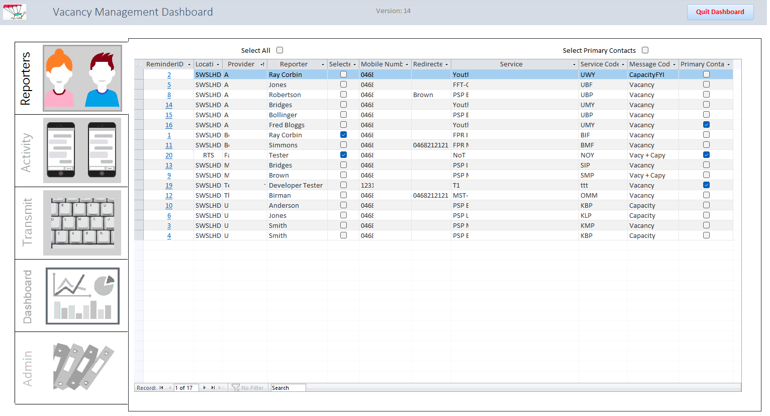
Solely for the sake of providing a range of examples, this is a button controlled series of subforms. It is all roll-your-own, and there are problems with that, the main one being that I am stuck with 5 buttons unless I rewrite a heap of stuff.
On the plus side, the users wanted the big graphics, and they find it very easy to use and also easy to train newbies.
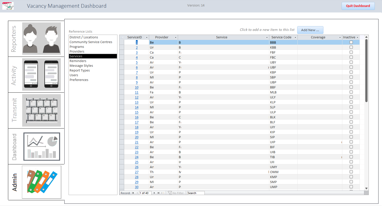
The actual putting together is fairly simple: 10 graphics for the buttons, and a white vertical line that you move adjacent to each button to make the tab integrate with the subform.
The app itself sends and receives SMS messages.

It is also easy to integrate the more complex stuff like Admin, which has 10 of its own subforms.

I'm not recommending you go this way. But you asked for examples, so presto!
Jack
Solely for the sake of providing a range of examples, this is a button controlled series of subforms. It is all roll-your-own, and there are problems with that, the main one being that I am stuck with 5 buttons unless I rewrite a heap of stuff.
On the plus side, the users wanted the big graphics, and they find it very easy to use and also easy to train newbies.
The actual putting together is fairly simple: 10 graphics for the buttons, and a white vertical line that you move adjacent to each button to make the tab integrate with the subform.
The app itself sends and receives SMS messages.
It is also easy to integrate the more complex stuff like Admin, which has 10 of its own subforms.
I'm not recommending you go this way. But you asked for examples, so presto!
Jack
Mike Krailo
Well-known member
- Local time
- Yesterday, 19:35
- Joined
- Mar 28, 2020
- Messages
- 1,660
I'm not sure about her exact reason, but there is the issue of not being able to interact between controls on different forms when using a Navigation control due to the fact that each form/subform is closed when navigating to each one. That isn't the case with tab controlled items, and that is a design factor to consider. I've heard of issues with flickering problems on tab controls that do not occur on navigation forms, so each one has it's advantages and disadvantages.@Pat Hartman should clarify what issue she sees with it. I've been using the control extensively recently and I've encountered no problems. Attached a sample.
isladogs
Access MVP / VIP
- Local time
- Today, 00:35
- Joined
- Jan 14, 2017
- Messages
- 19,554
One of the main advantages of navigation style forms is the fact that only one subform is ever in use at a time.
As already mentioned, I don't use the built-in version as I've had issues with that over the years, but the principle behind it is sound.
As already mentioned, I don't use the built-in version as I've had issues with that over the years, but the principle behind it is sound.
The tabs across the top show the dark version when selected but the tabs on the left show the light version
Yeah, that sucks, unless...It is not data bound.
Just an idea you could use for fun if you feel bored one day:you are limited to what you can fit on one page- Across and down so x * y is the limit
1. Add a bunch of buttons to the navigation form.
2. Give them array-friendly names like button1, button2, etc.
3. Using a global state variable like Tempbars, change what each button does according to the state and you'll have infinite options.
Another idea for a lazy afternoon:
Embed multiple vertical/horizontal menu layouts into other vertical/horizontal menu layouts
I believe Navigation Forms are excellent because they align with the typical user interface and user experience found on web platforms. Most apps probably won't need so many menu items that fill the entire screen in two dimensions anyway. It's important to remember that, as apps get larger, everything becomes more complex, including menus and including queries and most things. So, in my opinion, the Navigation Form is a great choice for most uses.
I know what you mean, but I've seen the same problem applies to tab controls, buttons and also anything that uses a theme. Access in general has a bug with themes, which is why when I'm going to use them I always preload the theme and color palette with VBA, to ensure it does not gets washed out out of the blue (that is the bug, all color references become White).I've heard of issues with flickering problems on tab controls that do not occur on navigation forms
Mike Krailo
Well-known member
- Local time
- Yesterday, 19:35
- Joined
- Mar 28, 2020
- Messages
- 1,660
In that case, you simply reduce those large amount of options onto its own form, problem solved.All it takes is for one of the major groups to have more options than will fit in the vertical constraint and that breaks the developer's design concept.
Mike Krailo
Well-known member
- Local time
- Yesterday, 19:35
- Joined
- Mar 28, 2020
- Messages
- 1,660
I understand the advantage of your lookup table app. Having a one stop shop to manage all of them is great.I think you missed the point. For example, if you are not using my lookup table maintenance application, you might create a dozen or more separate forms to handle lookup table maintenance. They should all be in the same top level group but if there are more than will fit in the left side list, you need to use a second tab in the horizontal group to list the remainder or create a different form within the navigation form to do the navigation for these objects because the navigation form cannot handle the case as other menuing systems can. There is always another way to "skin the cat". If you like using the navigation form, use it. I don't like it for the reasons stated so I don't use it. You can get around anything. I prefer methods I don't need to "get around".
Personally, I like the accordion web style navigation form since the menu system collapses to save space and it looks like your standard left navigation type web page. Any one of the top level buttons can be used as a regular button or serve as group identifier. It's more complicated to design, but I'm working on a way to make the maintenance of changes much easier to do and eventually package it into a class that will work on either the left, right, bottom, or top of the form. So far I like the way it has turned out, but it's going to need some more work before it's useable on any active projects. The last thing I need is a maintenance nightmare. I'm actually using your idea of the tblButtons to manage the menu and the forms to launch from the buttons.
murphybridget
Member
- Local time
- Today, 07:35
- Joined
- Dec 5, 2023
- Messages
- 96
I hope your efforts in refining and packaging it into a versatile class pay off without turning into a maintenance headache.I understand the advantage of your lookup table app. Having a one stop shop to manage all of them is great.
Personally, I like the accordion web style navigation form since the menu system collapses to save space and it looks like your standard left navigation type web page. Any one of the top level buttons can be used as a regular button or serve as group identifier. It's more complicated to design, but I'm working on a way to make the maintenance of changes much easier to do and eventually package it into a class that will work on either the left, right, bottom, or top of the form. So far I like the way it has turned out, but it's going to need some more work before it's useable on any active projects. The last thing I need is a maintenance nightmare. I'm actually using your idea of the tblButtons to manage the menu and the forms to launch from the buttons.
murphybridget
Member
- Local time
- Today, 07:35
- Joined
- Dec 5, 2023
- Messages
- 96
It sounds like a good idea my only fear is that it will possibly create redundant sub-forum.It's not clear if you want all three forms visible at the same time on one form?
You mentioned the tab control, so my assumption is you want to switch between the three forms, like on a tab control, but without the tab control.
It's important to know how a subform comes about. It's just an ordinary form! There's nothing special about it, except that it's housed in a control called a subform/sub report control.
I like to term this control "a window" because it's like a window pane in your main form and you can look into another form through the window.
Once you have established this window on your form you can put any form you like in it with VBA!
So an alternative method would be to switch forms with VBA code with command buttons or a combo box.
Similar threads
- Replies
- 11
- Views
- 327
Users who are viewing this thread
Total: 1 (members: 0, guests: 1)
