New look Access World Home Page (1 Viewer)

Dave

Administrator
Staff member
Local time
Today, 12:56
Joined
Jun 10, 2002
Messages
27
We are updating the look of our home page and seek opinions.

Our current home page is at: http://www.access-programmers.co.uk

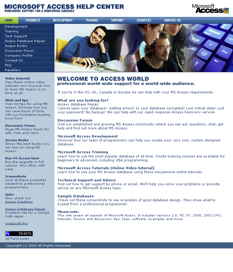
The new home page is at: http://www.access-programmers.co.uk/template.gif

We might show recent forum posts so that the site looks a little more active.

Can you rate out of 10 the old/new home page on layout, visual appeal and professionalism.

Any other suggests are greatly appreciated. e.g. what links would you like to see in the navigation bar, in the columns, at the front. All advice is considered.

It is likely we will include the last 10 forum posts on the home page. Also, how do you feel about having a page for the forums that lists the top posters and other stats?
 

spacepro

Registered User.
Local time
Today, 12:56
Joined
Jan 13, 2003
Messages
715
Jon,
I am a freelance web designer and the new look is certainly appealing and looks more professional.

As a access world member, I would like to possibly see a link to all attachments that have been posted in the forum, to help first timers/amateur programmers to quick find posted db's that might help there problem, as I noticed the same questions do pop up from time to time.

Maybe include some reference to vba/vb

Top Site!!

Regards
Andy:D
 

Fornatian

Dim Person
Local time
Today, 12:56
Joined
Sep 1, 2000
Messages
1,396
I've been a member here for a long time and have often considered that the one area for improvement is the visual presentation of the site - this can certainly contribute to a potential customers perception of the professionalism of the company.

From this perspective I think that the new home page is massive improvement on the prior and will certainly increase your possibility of winning work.

As you suggest it might be worth putting the list of active users on the front page so people can see if they want to delve further.

As for putting some recent posts up, that might not be the best advertisement because sometimes there's 'bitchin' between users of this forum. Maybe post some recent non-replied threads so people who know the answers might join the forum and thus cause them to revisit the site.

From my experience, download speed is one of the most important issues when designing a page, as I recall most people cancel the page request after about 30 seconds if the page isn't loaded.
I say this because I know you've loaded a gif animation of the page for consideration

I think it would be convincing also, if you posted some customer satisfaction statistics and comments to convince potential customers.

That me done, Oh, I think the new page scores an 8/9 and the old one 5/6.
 

Autoeng

Why me?
Local time
Today, 07:56
Joined
Aug 13, 2002
Messages
1,302
The photo layout is nice and professional in appearance. Links are often repeated though (Discussion Forum is accessable through 3 different links). Perhaps the selection bar in lower left position could have teasers for your Hint and Tips section. Under What Are You Looking For - Access Database Repair needs to be bolded.

Although the Forum is the reason I visit it isn't the reason you are in business. You are here to sell your wares and expertise. I would move Discussion Forum lower on the page and move up the pay services and offerings.

Previous page layout 6. New page layout 8½ for still offering the same basic layout and funtionality but 9½ for professional appearance.

Autoeng
 

Matt Brown

Registered User.
Local time
Today, 12:56
Joined
Jun 5, 2000
Messages
120
Firstly:

I'd say loose the free counter, you don't need it.

It gives the site a "Homemade" look, even on the new design!

They also slow page loading down.

I would check with your ISP to see if they have stats available for your site, if they don't suggest move to a better ISP that does give you this.
(I can name a few excellant ones based here in the UK if you need recommendations).

The overall new site design looks a lot better , more professional.
The old site reminds me too much of "been made with MS Frontpage" (yuck horrible program!!)

I agree with the other posts here about data from the forum, it can put people off if there are 10 bad posts listed.

Matt

BTW also a freelance webdesigner.

Overall a better improvemaent.
 

Only1Abhi

World Filled With Love
Local time
Today, 12:56
Joined
Jan 26, 2003
Messages
99
Old Site
Layout - 6/10
Visual Appeal - 5/10
Professionalism - 5.5/10

New Site
Layout - 9/10
Visual Appeal - 8.5/10
Professionalism - 9/10

I think u should have top posters because they get more publicity, they are happier and beginners know exactly who may be able to help.

Other Stats would also be good.

As matt said, chuck the counter as it makes your site look UNprofessional.

Apart from that, I think u need a new logo...
The text "Access World Forums" highly puts down your system and makes it look unprofessional. If you could replace that with a well thought of logo, boy you're talking!!! ;)
Infact I could make a logo if u want.. or u could run another forum like before asking ppl for their contribution.
Everything else is cool...

Regards,
Abhi
:)
 

ScottF

Registered User.
Local time
Today, 12:56
Joined
Mar 10, 2003
Messages
20
I'm new to this site and member of VB-world site. I have now started working in Access because of a recent project i bided on. I agree the new site is more professional looking and also gree with spacepro.
 

kbrooks

Still learning
Local time
Today, 06:56
Joined
May 15, 2001
Messages
202
Very nice. I give the original a 5, the new and improved a 9.
 

Newman

Québécois
Local time
Today, 07:56
Joined
Aug 26, 2002
Messages
766
I agree with the other posts.
Old one: 5/10
New one:9/10

You should not put the last 10 posts. You have no control of what the customer will see when he will be looking at it.

I know that you might need them, but I don't like the popup windows. When I go to a website and I see popups often I close them all, including the main window. I think that an inviting link on the main page does a better job. (My opinion!)

Overall, your new design is MUCH better. I like it a lot.
 

stardusty

Registered User.
Local time
Today, 04:56
Joined
Jun 14, 2002
Messages
18
Agreement with the many comments on it being more professional.

1. the graphics tend to pull ones attention off to left. if you could displace the white guy segment on the left over to the right with soft transition from keys to guy, it may cause the eye to rest left, hence nearer to list choices.

2. VIDEO TUTORIALS "...in no time at all?" tongue in cheek right?

3. ACCESS BOOKS - drop "Shows"

4. SCREEN SHOTS "View examples created...

5. WELCOME TO ACCESS WORLD: IF YOU'RE IN... guess I'm not familiar enough with the outreach, but you're not specifically ruling out databasers down south?

Thanks for the effort and the forum itself!

8
Easy to please; hard to satisfy.
 

hitchhiker

Registered User.
Local time
Today, 06:56
Joined
Apr 15, 2003
Messages
11
Looks great! Definitely a cleaner, more professional looking page than the previous version.
 

Newman

Québécois
Local time
Today, 07:56
Joined
Aug 26, 2002
Messages
766
I didn't notice it at first, but Stardusty is right about the graphics. The keyboard picture is getting the eyes away from the menu.
If you can change the position of that picture to the left, it would be better.

Also, I like the fact that it's shorter (less scrolling). Not every one uses 1600x1200.

One thing that could be added to it, is a kind of "mouse over" script for the menus. (making reference to the old one since I can't tell by a picture if it is already there in the new version).

As Matt said, the counter makes your site a little "amateur".
I don't remember the name, but I know there is a website that counts visitors on your site for you. (It actualy says where they come from(country), which page they visited and how long they stay at each one.) And all it displays is a little character in a corner. I think it is a «@» or something similar. I don't know how good it is, but might be worth searching for more info about it...
 

Crilen007

Uhm, Title... *shrug*
Local time
Today, 04:56
Joined
Jun 13, 2003
Messages
531
Change Tech Support to Technical Support, try not to short form if you can help it.

Great site!
 

Tekime

Registered User.
Local time
Today, 07:56
Joined
Jun 26, 2003
Messages
72
Looks much, much nicer. 7/10. stardusty made some great suggestions.

"What are you looking for" should be a little bigger, this way you can make "Access Database Repair" in bold and it will make visual sense.

I don't agree with moving the keyboard picture left though, I think the colors are too similar to the menu colorations.
 

Joe8915

Registered User.
Local time
Today, 05:56
Joined
Sep 9, 2002
Messages
820
Fine looking, I will give the new a BIG 9.9 and the old 8.9. I think you guys did a great job. I agree you don't need the counter and don't need the last 10 reviews posted. I never read it, I just want search topics.

Great work, keep it up:)
 

Naccessible

New member
Local time
Today, 06:56
Joined
Jul 29, 2003
Messages
5
New access home page is great!

The new access home page looks great! It is a vast improvement over the current page. Some things that could be changed though is:
1. Removing the question "What are you looking for?" and enlarge the Access Database Repair as the topic heading
2. Add a on-line visual basic tutorial area
3. Remove the counter.
Will the current posts remain? If not can a knowledge base of the information currently available be created?
My rating: Current site 6/10 New site 9.5/10
Great Job!
N-. :)
 

Tim L

Registered User.
Local time
Today, 12:56
Joined
Sep 6, 2002
Messages
414
This is a comparative score, before seeing the new site I'd have scored it higher:

Old: 7/10 New: 9/10

I don't think that there is any need to change the banner picture.

How will screen readers cope with the new page? It appears to be less friendly than the current one - I don't use a screenreader but it is something that someone else mentioned to me.

Agree about removing the counter, it's not necessary.

Also agree about not having the last 10 posts shown, unless you are prepared to vet them. How about putting the top 10 rated posts? Or the largest thread from each forum area in the last week? Although these could both lead to the same problem and I haven't actually noticed much rating going on.

I think that the text in the menu down the left side (Development - Resellers) could be a little larger, although this may squeeze the rest of the page slightly it might give more width for the items below, thus making the page shorter. I think that I read somewhere about most users not scrolling very far down the page so the shorter the better.

A link to a Site Map would be nice to see, as would a Search link.

Just a couple of other points:

As you are changing the front end, does this mean the forum will be redesigned too? (Personally I like it the way it is.)

I don't know if you are an independant organisation from Microsoft or not but is the MS Access Logo licensed for use? Also isn't this the old logo?

Keep up the good work, it is very much appreciated.

Thanks,

Tim
 
Last edited:

asmodius

Registered User.
Local time
Today, 12:56
Joined
Oct 22, 2003
Messages
60
I like the new one much better....

Theres something about the design of the second one that screams "reputable". I think it really exemplifies knowledge when your home page is that well designed. Kudos to whomever came up with it and I hope you end up using it.

Cheers,

Andy
 

Users who are viewing this thread

Top Bottom