You are using an out of date browser. It may not display this or other websites correctly.
You should upgrade or use an alternative browser.
You should upgrade or use an alternative browser.
Opinions please...
- Thread starter dan-cat
- Start date
boblarson
Smeghead
- Local time
- Today, 11:29
- Joined
- Jan 12, 2001
- Messages
- 32,025
Okay, here you go:
Visual:
1. Looks nice and clean, but not sterile. It has a warmth to it.
2. The navigation menu on the left looks pretty good, but I get a white flash every time my mouse moves (using WinXP, IE6). That can get annoying, but wouldn't deter me.
3. The color scheme doesn't seem to fit, in my opinion - Scarlet, Green, Yellow and Purple just don't seem to fit to me. I would go for more complementary colors - maybe just getting rid of the purple bar and using green that would go with the buttons and red and also with the fall scene picture.
Functionality
1. It functions well and the shopping cart seems to work extremely well.
2. Selecting items is easy to do and very self-explanatory.
Overall I would say that it is very good. I think it can be better, but I think it's on a good track.
dan-cat
Registered User.
- Local time
- Today, 18:29
- Joined
- Jun 2, 2002
- Messages
- 3,415
Okay, here you go:
Visual:
1. Looks nice and clean, but not sterile. It has a warmth to it.
2. The navigation menu on the left looks pretty good, but I get a white flash every time my mouse moves (using WinXP, IE6). That can get annoying, but wouldn't deter me.
3. The color scheme doesn't seem to fit, in my opinion - Scarlet, Green, Yellow and Purple just don't seem to fit to me. I would go for more complementary colors - maybe just getting rid of the purple bar and using green that would go with the buttons and red and also with the fall scene picture.
Functionality
1. It functions well and the shopping cart seems to work extremely well.
2. Selecting items is easy to do and very self-explanatory.
Overall I would say that it is very good. I think it can be better, but I think it's on a good track.
Thanks Bob,
When you say Scarlet, do you mean the color of the prices text on the products page?
I like the idea of using green, whereabouts did you think this color could be used?
EDIT: Also I was unaware of the flashing issue. I'm using IE7 and firefox and don't get the same effect. I wonder if anyone else is getting this?
boblarson
Smeghead
- Local time
- Today, 11:29
- Joined
- Jan 12, 2001
- Messages
- 32,025
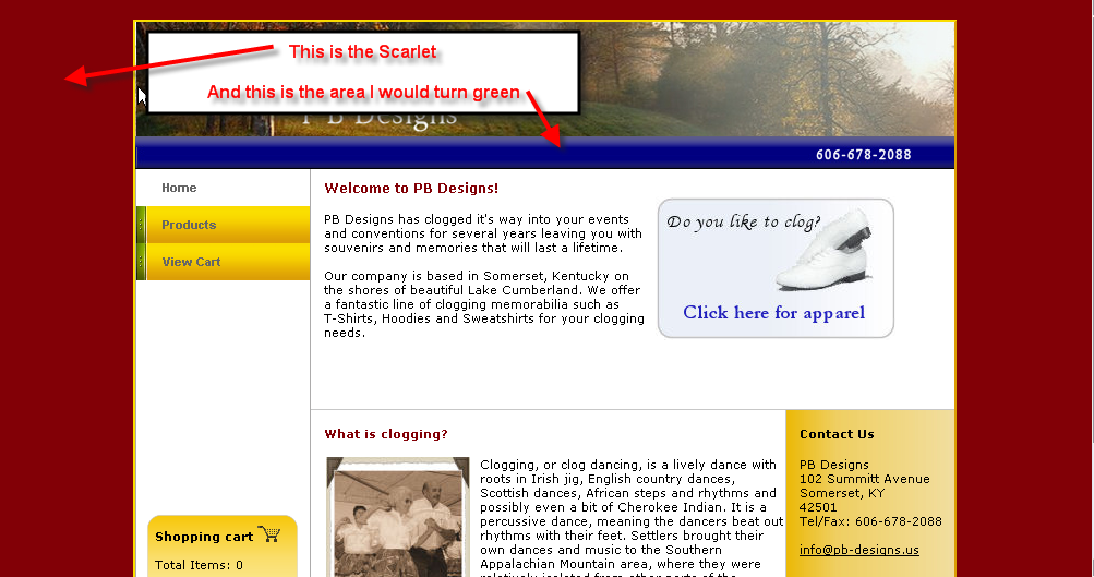
No, I mean the area that shows up around the page and the purple bar see below:When you say Scarlet, do you mean the color of the prices text on the products page?
...
I like the idea of using green, whereabouts did you think this color could be used?...
DanG
Registered User.
- Local time
- Today, 11:29
- Joined
- Nov 4, 2004
- Messages
- 477
I like it very much.
I think boblarson covered it pretty well. I had the same flashing experience with the menubar.
I'm kinda trying to figure out the color combination as well. I love the red, green and even yellow (a warm feeling descibes it well) maybe it's the blue that doesn't belong in the mix, but not sure.
In all, great job!
The only other thing I could add is (excuse my ignorance) don't cloggers wear "clogging shoes"? You should sell some of those.
boblarson
Smeghead
- Local time
- Today, 11:29
- Joined
- Jan 12, 2001
- Messages
- 32,025
ok, what color should replace the scarlet do you think?
I'm not sure what would be good there. I think you may have to play with some different combinations. If you use a light color, the feeling of the site will completely change, but if you use a dark color, it may overpower the rest. I think you should try several different colors to see what visually makes you go "WOW!" and then you can ask for opinions again. But, remember, you don't have to take the opinions offered as others may really like it the way you have it.
dan-cat
Registered User.
- Local time
- Today, 18:29
- Joined
- Jun 2, 2002
- Messages
- 3,415
I like it very much.
I think boblarson covered it pretty well. I had the same flashing experience with the menubar.
I'm kinda trying to figure out the color combination as well. I love the red, green and even yellow (a warm feeling descibes it well) maybe it's the blue that doesn't belong in the mix, but not sure.
In all, great job!
The only other thing I could add is (excuse my ignorance) don't cloggers wear "clogging shoes"? You should sell some of those.
Thanks Dan,
if people want to stick around, i'll upload some changes in a while. I know what people are saying about the purple bar. I'm going to change it to dark green and see what happens

Dreamweaver
Well-known member
- Local time
- Today, 18:29
- Joined
- Nov 28, 2005
- Messages
- 2,457
I like the brown around it and the banner, and agree with bob on the colour below the banner,
The only thing I did notice was the navigation when viewing a product categorie the main menu set back to it's closed default which meant if I didn't see What I wanted on the page I was viewing I had to either go somewhere else of go to the products and open the menu maybe a list of categories somewhere on the products page might increase your sales as they would be able to jump from one cat to another very simply.
I didn't have bobs problem with the main navigation turning white I'm using Firefox.
best wishes
mick
boblarson
Smeghead
- Local time
- Today, 11:29
- Joined
- Jan 12, 2001
- Messages
- 32,025
Ok, it's green now, but I'm not all that sure
Not dark enough. I would go with a more forest green (dark green) which would match the hill in the picture.
wazz
Super Moderator
- Local time
- Tomorrow, 02:29
- Joined
- Jun 29, 2004
- Messages
- 1,702
hi.
- i'm not getting the flash at all (XP, IE6).
- it looks like you've changed the color to green and it works well, although perhaps getting it closer to the green that we see on the far-left edge of the menu buttons would be better, to me; it's a bit too light, it think. i think the colour scheme is very good, matching the excellent photo very well.
- my critique is with the menu: when i select 'products' i like how the menu drops down, but after making a selection, i would like the products to stay dropped down.
very nice.
w
p.s. first time through the site i selected a couple items to the shopping cart. after closing the site and returning, the items were still there.
dan-cat
Registered User.
- Local time
- Today, 18:29
- Joined
- Jun 2, 2002
- Messages
- 3,415
jeez that was fast. nice job on the menu drop-down, too.
They call me quick-draw McGraw

I think the site is struggling with the sudden increase in hits, it keeps locking up on me
boblarson
Smeghead
- Local time
- Today, 11:29
- Joined
- Jan 12, 2001
- Messages
- 32,025
Isn't that always the way...if it isn't one thing then it's another...I think the site is struggling with the sudden increase in hits, it keeps locking up on me

dan-cat
Registered User.
- Local time
- Today, 18:29
- Joined
- Jun 2, 2002
- Messages
- 3,415
Isn't that always the way...if it isn't one thing then it's another...
If I get a stinky email from the hoster I'll make sure to copy everyone in
Thanks everyone, your help is very appreciated
")
Similar threads
- Replies
- 11
- Views
- 426
- Replies
- 19
- Views
- 1,489
Users who are viewing this thread
Total: 1 (members: 0, guests: 1)