You are using an out of date browser. It may not display this or other websites correctly.
You should upgrade or use an alternative browser.
You should upgrade or use an alternative browser.
creating clustered stacked column bar charts
- Thread starter prabhus
- Start date
Yes, send me some sample data, in a Database or Excel-sheet.Hi JHB, this exactly what i am looking, could you please help me, how to do it?
Tell which column should be stacked and which not.
What you show me in the Excel sheet are 2 stacked bar, not a cluster & stack column bar.Hello,
I have attached some sample data and the expected result in the attached xls file.
I am working with Access 2010.
Thank you very much for you help,
Hmmh ...
May be this is not the correct definition.
I thought "clustered" mean two adajacent column bars (stacked or not) bound to the same X-Axis value.
I just picked up the "definition" and the sample from this site dedicated to XL : peltiertech.com/WordPress/clustered-stacked-column-bar-charts/
Anyway, that is exactly what I am trying to do now with Access 2010.
So, if you can help me in achieving this, I would appreciate.
Thanks again for your time and help,
Honest, I've never thought so deep about that, I've only looked at the definition what MS-Access shows, for the column type.
The only way at the moment I can see a solution, is by placing two graph objects on top of each other, one transparent and one with a offset relative to the other, and the of cause with the same scale.

The only way at the moment I can see a solution, is by placing two graph objects on top of each other, one transparent and one with a offset relative to the other, and the of cause with the same scale.
Attachments
Hello JHB,
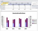
But the JPG file StackedClu.jpg you have attached on 02-23-2013 looks like a clustered stacked column chart (so combining both sub-types). This picture is what I am trying to achieve.
Could you post the accdb file you used to generate this chart ?
Euh ...wait... I think I got the point : your image is combining a column chart with a stacked chart while my request is to have a combination of two stacked charts which is not feasible apparently. The other solution with the offset you described is indeed a solution but rather tricky to implement. I''ll try that one if this is the only one available.
Last edited:
istudychimps
New member
- Local time
- Yesterday, 23:28
- Joined
- Jun 1, 2015
- Messages
- 3
Hi JHB, I hope you get an alert that I'm posting this since it's quite a while since the original post. Anyway - the combined clustered / stacked graph you posted in your picture is exactly what I need to do with my data. Can you please advise on how to do that? Basically, I have research data that I need to present as # interviews (Y axis) by month (X axis), case vs. control (clustered) and cases need to be stacked by hospital site (KCC vs. McLaren). Hope that makes sense? I'm attaching data - if you need more guidance please let me know. Please help - my email is pandolfs at karmanos dot org (it won't let me include my email address using normal symbols...)
THANKS!
THANKS!
Attachments
istudychimps
New member
- Local time
- Yesterday, 23:28
- Joined
- Jun 1, 2015
- Messages
- 3

istudychimps
New member
- Local time
- Yesterday, 23:28
- Joined
- Jun 1, 2015
- Messages
- 3
This is very helpful and exactly what I'm looking to do, but can you please explain how to adjust the query (or set up the report) so that I can re-create it for future use (I need to run the report monthly based on updated data). Thanks again for your time and help!
There should be no need for adjusting it, it is update automatic... but can you please explain how to adjust the query (or set up the report) so that I can re-create it for future use (I need to run the report monthly based on updated data). Thanks again for your time and help!
@JHB,
1. Is it possible to have query as source?
2. Do I have to create a table to drop it all into?
3. Can I have more than 1 chart on the same report (based on the same query)
Thanks
Update:
No longer relevant. Fixed it with pivot query.
1. Is it possible to have query as source?
2. Do I have to create a table to drop it all into?
3. Can I have more than 1 chart on the same report (based on the same query)
Thanks
Update:
No longer relevant. Fixed it with pivot query.
Last edited:
Similar threads
- Replies
- 24
- Views
- 1,224
Users who are viewing this thread
Total: 1 (members: 0, guests: 1)