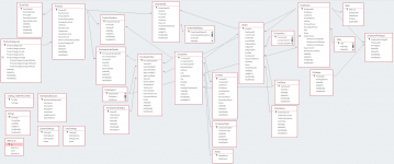
I managed to finally snag the new Northwind and I was really surprised when I opened the relationship window to see a huge spiderweb. I always thought that you shouldn't be able to trace your way from point A to point B via multiple paths as that would mean a possible circular problem (excluding particular one way joins). Obviously those who made Northwind are much, much smarter then myself but I am curious as to why the tables and relationships are the way they are.
I assume my assumption about tracing paths wasn't quite accurate based on this? I also see that, for an example, Orders has multiple relationships with Companies and I have personally never seen that before.
I assume my assumption about tracing paths wasn't quite accurate based on this? I also see that, for an example, Orders has multiple relationships with Companies and I have personally never seen that before.