I'm with Colin - you can change the font used for the VBE screen. I would NEVER use a sans-serif font or a proportional font in that context. Which is why Courier New is my preference. Though one could also use Lucida Console. You can also diddle with font size if you are like me and have some (minor - but annoying) vision issues. Since I use continuation syntax happily, it doesn't cost me that much to change away from 8-point fonts to maybe use 10-point or 12-point.
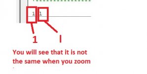
The point about NOT using sans-serif fonts is that I/1 issue doesn't happen. The point about using only non-proportional fonts is that every character takes up the same amount of space so if you have a single-quote and double-quote together, you can see the spacing better and know that you have a mixed-quote string. With something like Arial, you would see three tick-marks together and have some issues as to whether the leading or trailing tick goes with the one in the middle. The point of changing font size is that at 12-point, you are technically making your characters 50% larger than 8-point. You could go larger still but eventually you just need better glasses.