wiklendt
i recommend chocolate
- Local time
- Tomorrow, 07:14
- Joined
- Mar 10, 2008
- Messages
- 1,746
heya,
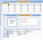
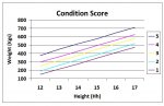
what i have now:
a graph which plots the "standard condition scores" for horse health (a comparison of weight vs height and how it relates to the horse's health). i have been able (in report design) to plot the lines for each 'standard' condition score. what i'd like to do now, is plot a given horse(s) weight/height onto the graph to make assessing condition score visual. (i have conglomerated many sources on assessing condition score and none are simple to use, so i want to do this as a nice graphical way to display relative condition of horses to a known standard).
see attached (also shown below) for a screen shots of my graph and data for the standard condition scores.
i was thinking to either:
(i) make the standard graph the 'permanent' set of series (each condition has it's own points) then simply add a second series (or just plot the x,y values via VBA?) to have a single point on the graph for that horse. (perhaps this can be done by having a layered graph, maybe? could cause issues, though if a horse is 'outside' the range....?)
(ii) have the horse's data point as the only series, and via VBA draw on the extra condition score lines (as opposed to keeping the datapoints for each standard of condition score, as i currently have).
i have the equations of the lines for each condition score in the format y=mx+b.
i've been searching for a few days on google and the forum. found a few good references but can't relate these to what i want.
http://www.vb123.com/toolshed/00_docs/spatialaccess.htm
http://www.msaccesstips.com/2007/08/ms-access-and-graph-charts.shtml
Attachments
-
 CS query.jpg62.7 KB · Views: 910
 -
 CS chart.jpg46 KB · Views: 979
")