Bean Machine
Member
- Local time
- Today, 04:13
- Joined
- Feb 6, 2020
- Messages
- 102
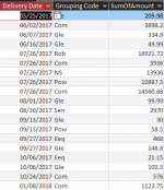
Hi all! I'm having trouble finding a solid way to create a scatter graph from a query that would show the yearly amount spent on each grouping of items (for example amount spent on wood, computers etc.). I've been using mm/dd/yyyy format for the dates in the table the query is pulling from and I want to isolate just the year and each item grouping to show, in a minimalistic and quick manner, the amount being spent on each grouping throughout the years to show any discrepancies where costs could be reconsidered or recouped. See image for more background on what I'm trying to accomplish.
Attachments
-
 example query image.png14.6 KB · Views: 234