Multiple Data sets on chart

El-d

Registered User.
Local time
Today, 13:00
Joined
Mar 20, 2013
Messages
32
Hi All,

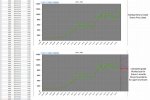
I have a simple line chart plotting price against date.

I would like to plot a secondary line on this chart from an array of data that I calculate. I've searched hi and low but can't seem to find a way of doing this.

The closest I've found is from this:-

3ws.utteraccess.com/forum/index.php?showtopic=1989354
(sorry not enough posts for a link )

I can create my array of data but I can't seem to get it to work and think it may be for pivot charts....which access 2013 can't do anymore.

Can anyone give me some idea as to how to plot multiple data sets on the same graph in Access 2013.
Thanks.
El-d
 
Show some sample data + how you want them in the graph, (a printscreen)!
 
Hi,

I've attached an image that hopefully explains things.

The bottom graph is a Photoshop mockup.

The calculated array of data follows a similar pattern. ie Date for next 3 months and an upper and lower value that will follow a curve starting at the last history date.

El-d
 

Attachments

  • graph.jpg
    graph.jpg
    96.5 KB · Views: 112
Hi,

I've attached an image that hopefully explains things.
..
Sorry not really, I'm still not getting the idea of what you want. :o
 
Curses!... Try again.

Lets say the current date is 1st Jan 2015
I have a history of share prices running from 1st Jan 2014 up to the current date(1/1/2015) that is plotted as a line graph.

In Vbscript, I am calculating a number of values and placing them in an array. I do this twice. Once is for an upper limit and once for lower limit.
For simplicity, it could just be the upper values as the principles / code could be applied to upper or lower.

This data is calculated from the current date (1/1/2015) for 3 months to 1/3/2015. This data is basically the next 3 months dates with a price value.

In effect:-
I have a graph of price up until the 1st Jan 2015.
I calculate price values from 1st Jan up to 1st March 2015 and put them in an array.
I want to plot this array on the same graph by adding a 2nd series.

In my example I have the actual historical data. From the end of that data, I calculate(predict) 2 series of data that I wish to plot on the same graphs.
One is a range above the current price and one is below the current price. The values calculated are price against date as per historical data but is calculated for the next 3 months.
I want to plot as a curve from the current date (1/1/2015) up until the 3 month future date (1/3/2015).

Hope that's a little clearer :)

El-d
 
Okay - I've some ideas but I need some sample data from both, the array and the history.
 
Hi,

I've attached a test.accdb.

Its been hacked from the original db.

In the original, the history table is a query from a larger table.
The Between table is the calculated upper and lower limits written out to a table. These values are usually in two arrays.

I suppose to recreate what I have would be :-
Create a query of the history table and use that as my history graph
Vbscript, read upper/lower values from between table into an array and plot that on the same graph.

maybe I'm just going about this all wrong and just need to create new tables, add extra fields and append.
However, I'm sure it must be possible in code without additional tables :)

Thanks for your help.

El-d
 

Attachments

Hi JHb,

Just checking in to see if you've had any chance to have a look and whether your initial ideas are workable.

Thanks,

El-d
 
Sorry - I had no luck.
But I think you had an acceptable solution your self:
maybe I'm just going about this all wrong and just need to create new tables, add extra fields and append.
 
Thanks anyway. I suspect its just a mindset that I need to get into for working with DB. Creating tables isn't the worst thing to do :).
El-d
 

Users who are viewing this thread

Back
Top Bottom