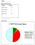
I’ve got a simple dataset that will ALWAYS have 4 rows, against which I have assigned the colours Green, Amber, Red, Grey. So I made a simple pie-chart to go on the report, but I can’t work out how to assign the same colours.
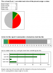
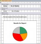
Please see 3 attachments showing the current layout, the preferred layout (which I mocked up in Excel) and the chart settings screen.
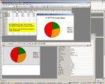
The chart is “working” OK i.e. 4 slices appear and they are the right size, but when I open the chart, I see only East, West, North. So I’m unable to manually set the colour for the 4th slice.
Is there a way round this? Thanks,
Pat
Please see 3 attachments showing the current layout, the preferred layout (which I mocked up in Excel) and the chart settings screen.
The chart is “working” OK i.e. 4 slices appear and they are the right size, but when I open the chart, I see only East, West, North. So I’m unable to manually set the colour for the 4th slice.
Is there a way round this? Thanks,
Pat
")