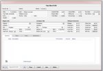
Over the last few years I have designed several applications in Access, and they all have one thing in common:
a simple but elegant user interface.
For input forms I have experimented with dark background colors, light backgrounds, backgrounds with images
and gradients (causing form flicker), different fonts etc.
And while a dark background such as charcoal or black may look cool at first sight, I always come back to
an off-white or very light beige with white text boxes and black Tahoma fonts in 8 or 9 px.
I use other elements like lines and boxes sparingly and certainly nothing with bright colors.
And with all fields arranged in logical order my forms may look boring but they are easy on the eye, even after many hours.
With continuous forms I am very careful with alternating row color, making sure there is not a strong contrast.
I also abandoned the idea of using custom images as buttons, the standard ones will do just fine.
In my opinion functionality and a pleasant interface go hand in hand.
Catalina
Attachments
-
 ScreenShot.jpg82.5 KB · Views: 191
")