Believe it or not but this isn't a joke, or misinformation.
When someone makes up this rubbish to justify spending £532,000 and isn't sacked they can only be working for the government.
Basically they have switched CHR(46) with CHR(263) and issued an invoice for £523,000. Certainly beats working.
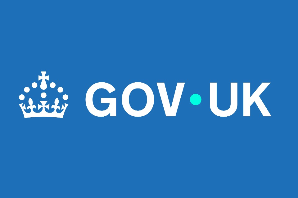
The Whitehall communications diktat explains the significance of the dot in the logo for GOV.UK, the Government’s main website, with detailed instructions on its “brand guidelines”.
As part of a rebrand of the site, the full stop between the words “GOV” and “UK” has been moved upwards from its position at the bottom of the letters to halfway between them. The idea is explained in the guidance as a “concept” that can act as
“the bridge between government and the UK, by the side of users to help make information and services easier and more useful”.
The guide adds: “Used within our wordmark and as a graphic device across all GOV.UK channels, the dot is a guiding hand for life.”
The dot is a circle on a background of a different colour, and will be used in graphics for government services.
Monochrome logo replaced with more blue, with a redesign that government hopes ‘works for everyone’, while other new features, such as animation, to become evident on incoming app and wallet The Government Digital Service has unveiled a redesign of the GOV.UK logo and text that introduces col

www.publictechnology.net
All of us in the UK are so thankful and simply amazed at this huge technological advancement. We are truly World leaders in the use of a dot.

