You are using an out of date browser. It may not display this or other websites correctly.
You should upgrade or use an alternative browser.
You should upgrade or use an alternative browser.
Our new home - post your opinions here
- Thread starter Jon
- Start date

bob fitz
AWF VIP
- Local time
- Today, 10:23
- Joined
- May 23, 2011
- Messages
- 4,801
Thanks Adam.Bob, they gave you the right instructs. after clicking it in the right pane, it takes you there. the only difference is that the list is now separated by type of user:
most of those are probably unread ones that were sent by me.
")
Dreamweaver
Well-known member
- Local time
- Today, 10:23
- Joined
- Nov 28, 2005
- Messages
- 2,457
Noticed some posts being updated with Question Etc Can somebody let me know how to do it as can't see it
thanks mick
thanks mick
- Local time
- Today, 04:23
- Joined
- Feb 28, 2001
- Messages
- 30,832
Don't know how to count this - as a bug or a feature or just confusion. When looking at the list of forums, there is something that is misleading and I don't recall that the old system worked this way.
Let's say that I look at the individual threads listed under General. I respond to the first, third, and fourth, but the title of the second problem tells me it is something for which I have no expertise. I don't respond to that one. So now when I am looking at the list of threads under "General" I will see that the bolding on the first, third, and fourth items is gone, but the bolding on the second item remains. Still not an issue. That part is expected behavior.
But now when I step one level up the tree (to see all topic headers), what I see is that General is bolded but the title that is bolded is the FIRST title. I sort of recall that on the older s/w, it wouldn't show me the first title in that case, it would show the second title because that is the one that would cause the bolding under General. Maybe my memory of that is wrong, and it isn't a show-stopper by any means. But it caught my attention.
vba_php
Forum Troll
- Local time
- Today, 04:23
- Joined
- Oct 6, 2019
- Messages
- 2,824
Jon, I just noticed this. some of the email alerts coming from the forum are being thrown by gmail to the wrong inbox. and some aren't. I don't know what you can do about that, because I'm not sure if those genuises have server black lists, a list of "suspicious" servers, or if their algorithms are just analyzing too much, like all those big playing jokers. this is just 1 I saw. before I took this image, I had already moved 3 others from this box to the real inbox. actually, this is kind of comical, considering that one of google's own emails is sitting in this box as well. see here:
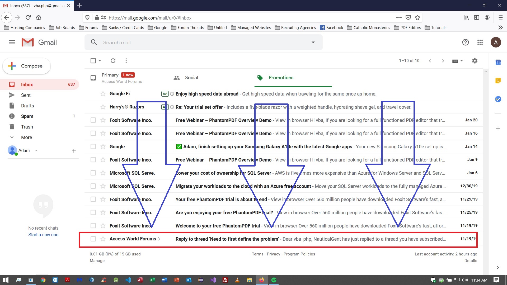
see here:Attachments
vba_php
Forum Troll
- Local time
- Today, 04:23
- Joined
- Oct 6, 2019
- Messages
- 2,824
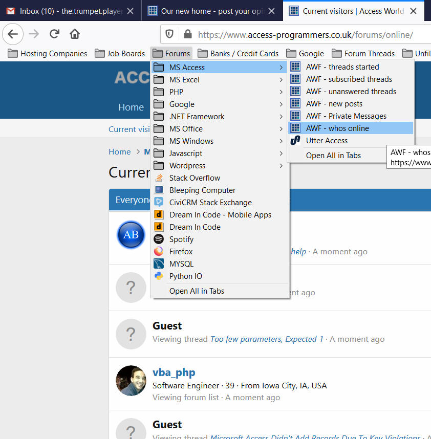
are you talking about the "whos online" page, Jon? Personally, I think that thing under this new system is not so great because you have to look at 5 different pages to find *everybody* that's online, sectioned out by type of viewer. and by "latest posts", do you mean "new posts"? I don't see "latest" anywhere on my screens. where's it at?Do you think we should move the Staff Online widget to below Latest Posts? I am wondering if this will improve usability a little.
Gasman
Enthusiastic Amateur
- Local time
- Today, 10:23
- Joined
- Sep 21, 2011
- Messages
- 17,518
Seems OK where it is.?Do you think we should move the Staff Online widget to below Latest Posts? I am wondering if this will improve usability a little.
Can you shrink the profile posts and increase the latest posts.?
This keeping the text in the editor is a really nice feature when you have to go off to check something.
")
Last edited:
isladogs
Access MVP / VIP
- Local time
- Today, 10:23
- Joined
- Jan 14, 2017
- Messages
- 19,500
Third vote for version 2.
I rarely use the Forums page in the above pictures as I just click on What's New.
However, I agree about putting the latest posts at the top as that's the most useful part of the right hand section.
Whilst I do like much of the new layout, there do seem to be fewer posts on the screen at a time than with the old software.
Is it possible to slightly reduce font size or item spacings to reduce the amount of scrolling needed in a long thread?
Last edited:
- Local time
- Today, 10:23
- Joined
- Sep 28, 1999
- Messages
- 8,082
@isladogs I think it is a playoff between readability and scrolling. I want to leave it to the Xenforo designers original intentions as I believe they are likely to have done research on this. In fact, Google even factors these sorts of things now. In Google Search Console, it talks about text being too small on mobile etc.
D
Deleted member 147267
Guest
Let me set the stage - when it comes to social media, I am the poster boy for 'clueless' .
If the same person "follows" you in this and a similar forum, does that mean I have a fan?
Or am I being stalked? I laughed when that thought came to me, but it made me realize that I don't grasp the meaning of it. Surely this person doesn't regard me as someone noteworthy or all that knowledgeable in Access such that I warrant following, because that person is no Access dummy for sure. Regardless of the reason (which I suppose only that person can divulge) what is the meaning of "following" someone from the perspective of a forum? Maybe I ought to reciprocate if I respect their knowledge (I do)? Or will that appear as reciprocation just for the sake of it?
Similar threads
- Replies
- 3
- Views
- 1,359
- Replies
- 6
- Views
- 1,473
- Replies
- 50
- Views
- 6,155
Users who are viewing this thread
Total: 1 (members: 0, guests: 1)